.webp?width=12693&height=4513&name=Sauce%20Logo%20Dark%20Ht%20(1).webp "Sauce logo")

.webp?width=180&height=64&name=Sauce%20Logo%20Dark%20Ht%20(1).webp "Sauce logo")

by Kim Garmon Hummel, on Oct 22, 2019 12:00:00 AM
A landing page is a page with one purpose: to convert visitors into leads. Unlike a traditional webpage, a landing page removes all distractions, including the navigation menu, links to additional information and even Calls to Action (CTAs) to other content. This allows you to guide the visitor to what you actually want them to look at, which in most cases, is a lead form.
You may have already jumped on the GDD (Growth-Driven-Design) bandwagon and built a beautiful, new launchpad website, but where do you go from there?
If you’ve learned anything from following the best practices of GDD, websites are not a field of dreams and ‘If you build it, they will come’, does not apply. You need to offer your audience something in return to convert them into leads and that’s where the landing page comes in!
Now that you know why you should include landing pages on your website, read on to learn what makes a landing page that converts!
5 Hard-and-Fast Rules For Creating The Perfect Landing Page
Get Rid of Your Navigation & Links
Yes, I mean it, get rid of all your navigation. Your landing page has one job: to convert your site’s visitors into leads. The people visiting your landing page were compelled to do so when they saw what you were offering, i.e. what’s in it for them, and they were ready to learn more about it.
But the fact is, the average site visitor has limited time and a limited attention span. The last thing you want is for them to land on your page, get distracted by a link and leave without giving you their information.
Only 16% of all landing pages are free of navigation bars – that’s a scary fact. Be part of that 16% – keep navigation and links off and keep your visitors on your landing page.
Use an Attention-Grabbing Headline
Research shows, that out of every 10 people visiting your landing page, at least 7 of them will bounce. You got them here with an attractive offer, now match that with an attractive headline. Your audience wants to know how you can solve their problem, that’s why they came to your landing page. If they get there and your headline is not compelling, offers them something different than what they came here for or is just plain confusing, they will quickly become disinterested and leave. Studies show, you only have 8 seconds to make an impression.
So how then do you create a bold headline that makes sense for your offer? Here are 5 different headline formula’s that convert (according to Wordstream):
- The Testimonial: The key to using using this formula is to let your customers do the work for you! 85% of people report trusting online reviews as much as personal recommendations, so they’re a great way to keep a visitor interested. Your customer had a good experience, so should they.
- The Cliffhanger: This formula tends to be the most clickable because it’s the most bold. By starting a headline with “This” or “When”, you can create enough intrigue about your subject that your visitors will need to find out how your offer can help them.
- The Value Proposition: Your audience has a problem and you have a solution. This one’s simple – use your headline to state what the user values most and how you’re able to give them that more than anyone else!
- The Listicle: People love lists because they’re an easy and effective way to get information and more often than not, entertaining. Use a list headline to quickly grab the attention of your visitors and reel them in!
- The How-To: The point of the ‘How To’ is to get to...the point. Allude to what problem you can solve for your visitors right in the headline – that by signing up for your offer, they will learn how to solve their problem.
Keep Your Headline, CTA & Form Above the Fold
“Above the fold” is a marketing phrase that refers to anything that is visible without the user having to scroll down. The most valuable real estate for any landing page is above the fold. You’ve already hooked the user with your offer and a promise to solve their problem. The last thing you want to do is bury important information at the bottom of your page, like your headline, the description of your offer and, most importantly, the form you want them to fill out. A great landing page includes these 5 items above the fold:
- A compelling headline that makes a statement (see above).
- A description that compels the visitor to continue and fill out your form.
- An attention-grabbing image related to what your offering.
- A lead form that doesn’t ask too much for what you’re offering in return.
- A CTA that tells the visitor exactly what to do.
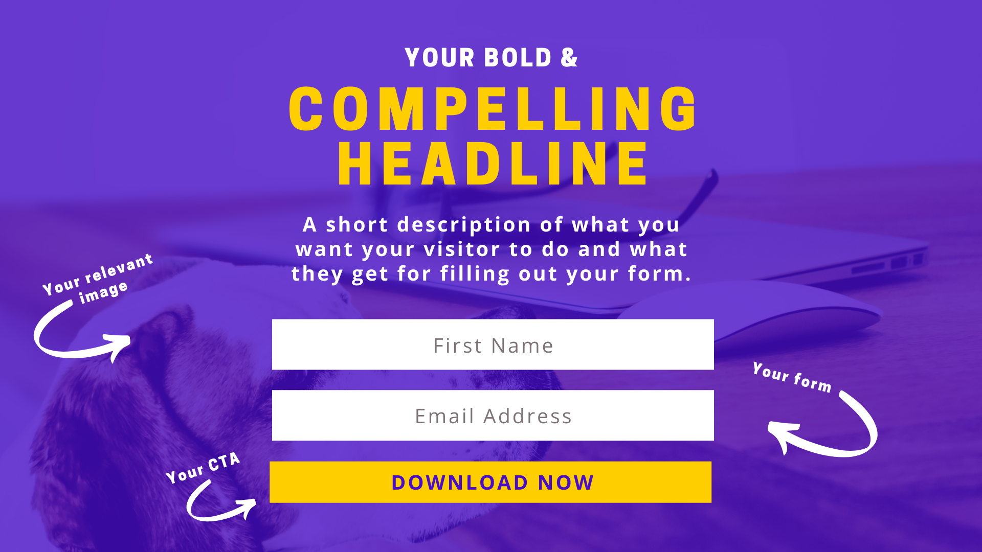
Any information you include below the fold shouldn't be a mandatory read. The key here is, your audience shouldn’t have to read it in order to be convinced to give you their information. The information presented above the fold should always be enough.
Present an Attractive, Relative Offer
Why should your visitors give you their information? What’s in it for them? This is what you need to ask yourself when choosing an offer. There are so many different formats you can use to present information in a way that is easily consumable for your audience. Here are some of the more common ones:
- Ebooks & Guides
- Live Webinars and E-Courses
- Free Consultations
- Infographics & Checklists
- Reports & White papers
Once you choose the format, make sure what you’re giving is equal to what you're getting. For the most part when it comes to forms, less is more, and if you’re not careful, one extra field could cost you. Expedia learned the hard way when they removed a single form field, resulting in a $12 million dollar gain. Most of the time the "less is more" rule applies, but the general rule to live by when it comes to asking for customer information is that what you’re offering should correlate to the amount of information you require a visitor to give you in return. For example, if you’re a home cleaning company offering a downloadable infographic with tips for spring cleaning, you shouldn’t request that they give you a phone number. A person looking to download an infographic is a person still high up in the funnel. They’re likely not ready for a sales call. A more reasonable ask would be for an email address which you could then use to nurture the lead further, later down the line turning them into a customer.
Create a Thank You Page & Help Them Through Your Buyer’s Journey
You’ve sold them – hooked them with a compelling headline and content offer that was convincing enough that they filled out your form. Now what? Don’t abandon them right after you’ve gained their trust! Beyond being a great way to present the download to your lead, there are many different reasons to include a thank you page.
It’s an excellent way to continue the conversation with your new contact rather than leaving them with a simple “Thank You” pop-up.
The number one reason to redirect them is that, by following best-practices and removing your navigation, you’ve now trapped the user on a landing page with no where to go. They have no way of learning more about you and your company, or what additional services you have to offer. They are simply, lost.
Having multiple offers on your landing page could cost you and has shown to decrease conversions by up to 266%, but this statistic doesn’t include the thank you page. Another great reason not to leave them stranded is that a thank you page is a GREAT way to start a conversation and keep them engaged. This could mean hooking them with another offer maybe to download more relevant information. Depending on where they are in the buyer’s journey, it could also give you the opportunity to present them with a chance to chat – a chance to turn that lead into a customer! Beyond that, plain and simple, a thank you page is just a good way of thanking your visitors for their interest in what you have to offer.
When Should You Launch Your Landing Page? Right Now!
By now, we’ve hopefully given you few compelling reasons to start churning out new content and creating the perfect landing page, but this doesn’t mean you have to go it alone! Though you may know all the ins-and-outs of your industry, you might still need some additional guidance when it comes to presenting the right content (in the right way) and that’s where we come in. If you’re feeling stuck give us a call and we’ll get you on track to more leads with landing pages that convert!